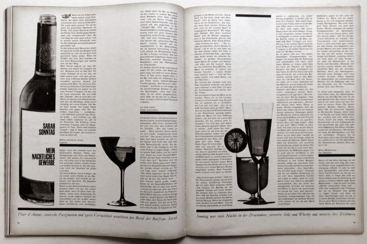
Many designers will be familiar with Twen magazine as much has been written about its pioneering design. I wanted to collect together a few of my favourite layouts.
Twen was published monthly throughout the ’60s. Not shy of nudity, the slick German magazine was aimed at “people in their twenties, from 15 to 30” (hence it’s name), the first generation to grow-up after the Second World War.
Willy Fleckhaus (1925-1983) art directed the title throughout its lifespan and took on much of the editor’s role. Fleckhause’s design principle was to ‘illuminate words’ which he achieved through ground-breaking typography and bold picture usage. The ADC him as:
“…a master of visual montage. Each, through selective cropping, framing, reducing and enlarging, were able to elicit specific editorial and emotional responses from readers and viewers alike. Power of this magnitude was indeed a stroke of genius!”
Its stylish typography and bold photography still look innovative today. Every layout tool is being used and every page-busting design turns your head and teases you in to look closer.
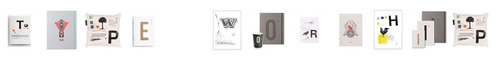
These greeting cards, notebooks and cushions were designed by Berlin based design agency, Strichpunkt (Semicolon). Created for their own alphabet focussed online store, Type Hype, many of the product designs won recognition in the recently announced 2014 TDC awards.
“The design lines for paper goods, the home collection, accessories and fine food range from Bauhaus to vintage and are all produced on a sustainable basis.”
One cool idea is the ‘Set Creator’, which allows you to type in a word and the store will bring back random products that spell it out, voila!:
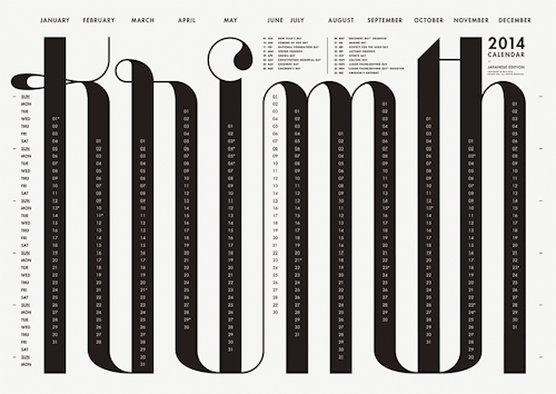
I noticed the team had also designed this excellent 2014 typographic calendar for their client Papierfabrik Scheufelen.
(Using: FF Scala Regular, Caps, Italic and Univers Condensed).
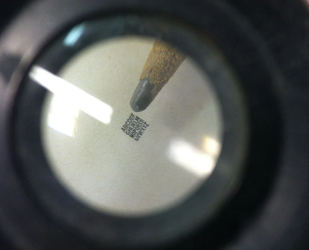
“Here’s The Smallest Reproducible Font of Caps In The World!”
Whoa, this is impressive. Legendary. We’ve heard tell of such a matrix from some retired local line casters, but to see it up close and personal is quite impressive. A cap alphabet in the space of a 6pt em space (roughly). This mat was created and distributed as a promotional piece used to demonstrate the level of quality that Linotype’s “typographic laboratory of the world” was capable of.
We recently ran it through our machine and cast a couple slugs. Sure enough, as advertised, it casts and prints.
Thanks to our neighbors at Lowell who gifted us this piece of Linotype history.
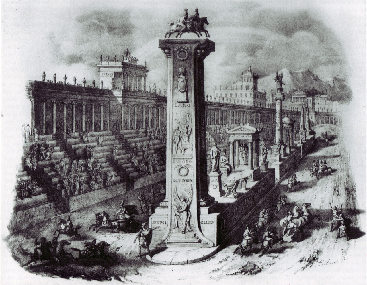
of typography letterings within the urban life made around 1850 with aquatint method by Antonio Basoli. He was an italian engraver, scenic designer, interior designer and painter living in Bologna. One of his most important references is the scenography in the theatre of rome and of yourse his works above. Enjoy them!
Found some very inspiring type for you all today, be sure to go over these with a fine toothed-comb. There is a lot we can learn from Mr. Cantrell, this guy’s portfolio is just mesmerizing.
Stamp verso of a photo, late 19th century. Cabinet card of B. Facchinelli, photographer in Cairo. Printed by Eisenschiml & Wachtl, Vienna. Part of Ken and Jenny Jacobson Orientalist Photography Collection. Hi to the thegetty
In the 1950s, Blake began using ‘found letters’ or commercial lettering in his work, as well as printed materials such as comic strips and advertising texts, allying himself with sign painters, decorators, and commercial artists. Declaring himself a ‘pop’ artist, he joined the ranks of Lichtenstein, Rauschenberg and Rosenquist, in their provocation of the fine art establishment. He is famous for the cover of Sgt. Pepper’s Lonely hearts club band.
The Wiki Truth, is a series of five gigantic books. Each book is ‘one page’ of Wikipedia. With these series I want to show how information has changed. 50 Years ago, we had an encyclopedia in our closet, our source of information. There were no doubts, the written information was our truth. Nowadays the truth isn’t fixed anymore; it became transient. It’s the wisdom of the crowd. And an endless amount. I get lost in this forrest of information.
For making the books, I asked ‘Wikipedians’ what the most large articles were on Wikipedia. They gave me a top 100; and I decided to print the top five. I spend days with downloading, each article is about 3000 pages long. I printed those, on my home-printer, and finally made classic encyclopedias of it. On the bottom of the book you read the first sentence that was ever written in this article; and at the top of the book you see the article as it is now. You see the information being created, being changed, being criticized, and being deleted. It are not professors who write the information, but Missy_1987, TonyTheTiger and Anonymous225.
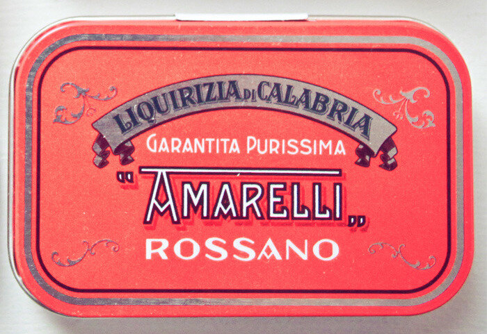
Leone and Amarelli are Italian candy companies that have been around for centuries. Amarelli has been making licorice since the 16th century, and Leone has been making candy since 1857. These tins are re-prints of the originals and are just as exquisite.