


Louis John Pouchée alphabets
Described as the most ambitious and most beautiful types created in wood in any period, these alphabets were once presumed lost in a fire in 1940 at Monotype’s London office.
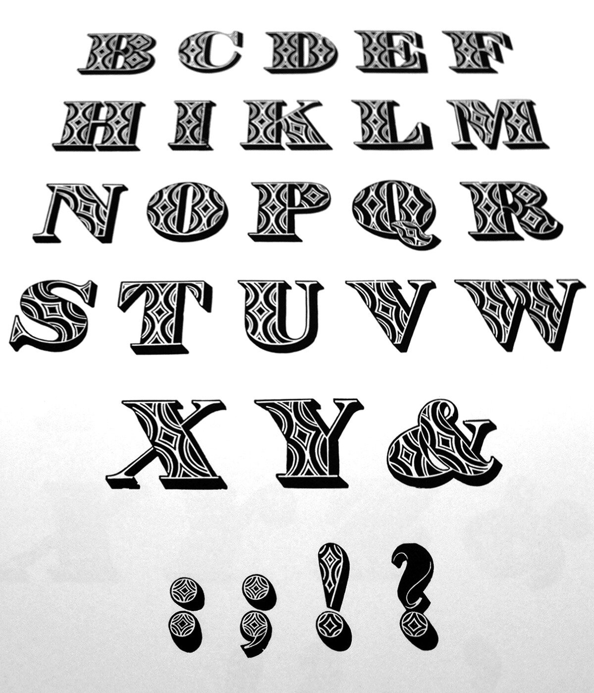
Designed for eye-catching headlines or for highlighting a word in printed posters, some of these fat face and slab serif letters look as if they could have been designed in the 1920s, or even the 1950s, judging from their patterns. They were actually designed in the early 1820s, even earlier than the more familiar Victorian ornamented type.
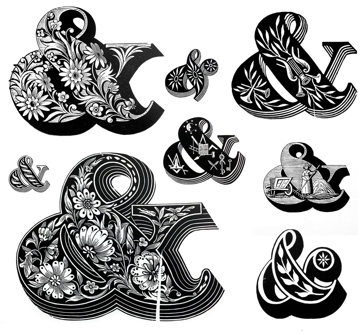
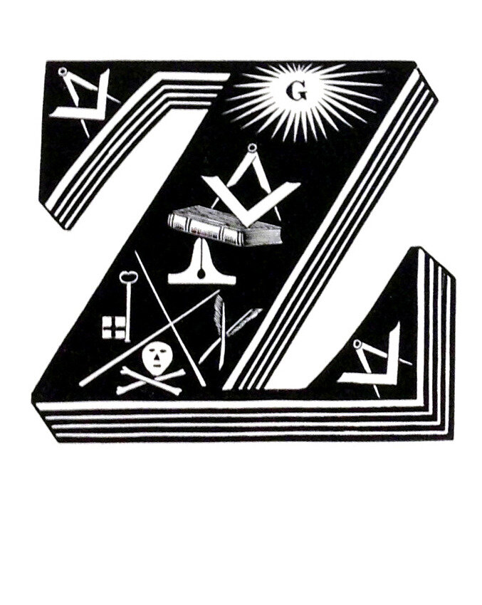
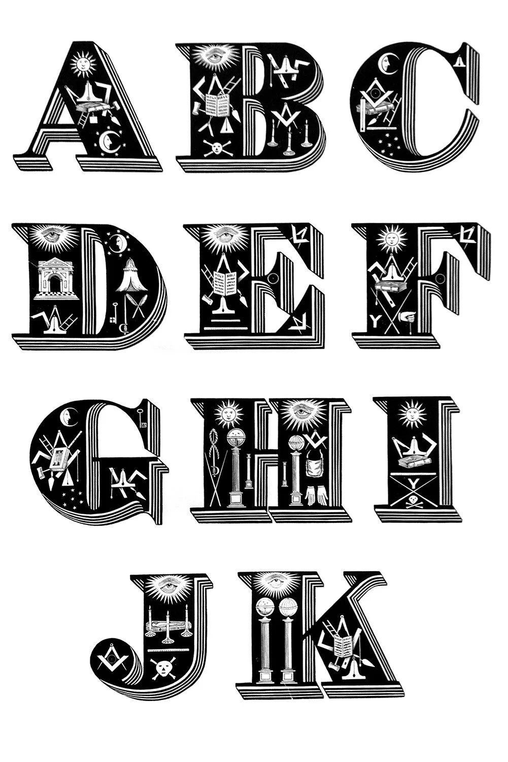
The astonishingly intricate letter designs feature a variety of ornamental motifs; plant forms, agricultural, musical and even masonic symbols. The level of detail in these, once innovative engravings, is incredible.
The above images are from Ornamented types: twenty-three Alphabets, from the Foundry of Louis John Pouchée. It’s a limited edition boxed set of large, unbound, deckled edged, printed sheets available to view at the St. Bride Library, which also holds the original wood blocks used to print the edition.
Printing from the blocks in the mid-90s was a collaboration between James Mosley, the former Librarian at St. Brides, and Ian Mortimer, of I.M. Imprimit, who designed and printed the limited edition.
When printing started, the provenance of the blocks was still a mystery. James Mosley had shown a few printed examples of individual letters in the ‘60s, suggesting that they might be from Pouchée’s foundry. However it wasn’t until Ian and his team were two-thirds through printing the cryptic alphabets that their identity was confirmed. Mosley matched them to a specimen; Specimens of stereotype casting, from the foundry of L. I. Pouchée 1, which even quotes the prices charged for the types.
The printing of this historic record was an extraordinary feat. The blocks were originally designed to be stereo-typed—used as patterns for casting metal type—and were never intended for printing. Therefore the blocks were never squared-up or made type high. This, together with the fact that their surfaces had warped slightly over time, meant that no automation for inking or printing could be used.
Painstaking techniques were used for making ready and inking the blocks. Each had to be packed and adjusted on the press to achieve a good impression. To ensure that both the engraved detail reproduced crisply and that the solid areas remained fully opaque, different sized rollers were often used on the same block to apply different densities of ink. A large roller with a fine film of ink was used for the detail and a small roller with thicker coverage was used for black areas. The few splits and marks, which eventually helped confirm the identity of the blocks, have been left. The edition took almost four years to complete.
Describing the design and typography of the printed edition, Ian told me that it had been agreed with Mosley that the letters should be allowed to speak for themselves with no clever layout or fancy typography to distract from them. The edition has a self-effacing layout with no secondary colour. The display type, Caslon’s two-line English Egyptian, was especially cast from surviving matrices. Two hundred and ten box sets were printed and it was agreed that the original blocks should not to be printed from again for fifty years.
Four of Pouchée’s printed letters were later used under license for the Pulp album cover, We Love Life, by Peter Saville in 2001.
I’ve chosen just a small section here. I was especially taken with the masonic alphabet. The ‘Z’, shown above, I’m told features authentic symbols that mark Pouchée out as a serious mason. Note the incredible printed detail achieved on the book in the centre and also the ‘G’ referring to God at the top. (Some of the other masonic letters show the eye of God). It was a privilege to be able to browse through it.
1The specimen title, shows founder’s name with an ‘I’.
The original Pouchée alphabets are © St Bride Foundation and I.M. Imprimit and are used with permission and my thanks.
Thanks also to Bob Richardson of the St. Bride Library—who first showed me the alphabets—and Ian Mortimer of I.M. Imprimit for their time in answering questions and reviewing this post.

Irving Harper, graphic design for an ad, 1948. Via Herman Miller.


NUVOLE
by mazzottibooks.co.uk

-The Book Marauders

Nicole Franzen


Erik Nitsche, gold embossing design for book binding of the series New illustrated library of science and invention, 1962-66. Editions Rencontre, Lausanne, Switzerland. Source

Goudy Heavy Ornaments
Deception in Fixing - Héloïse Parke
When I first set about putting down some opening remarks about Readable Objects, the exhibition that we opened recently at The Aram Gallery, I found myself consistently getting tongue-tied. Whilst words like ‘fix’ and ‘repair’ have taken on a new lease of life of late in a design context, they just didn’t seem the right fit for the work of Tomorrow’s Past.
Tomorrow’s Past, nine of whose members exhibit in Readable Objects, are an international collective of bookbinders who deal with the conservation of damaged books. As a group of like-minded individuals they have a manifesto which states that the books they select for rebinding must have been printed before 1900 and must come to them in a state of distress: casing lost, stitching unravelling or fraying, pages nibbled or waterlogged, or the text block left vulnerable. Tomorrow’s Past select books which have been neglected.
The problem with using the word ‘fix’ is that it implies the subject of the necessary fixing is broken. Despite a dictionary definition of ‘fix’ being to ‘put back into working order’ and that is what Tomorrow’s Past do, it still feels inappropriate.


Since I came to London, I have been always missing out on Bookbinding exhibitions but this time, I managed catch this just as it opened. Readable Objects, not only is an exhibition of bookbinding and bookarts, but I simply love that there is a table of maquettes of the experimental bindings as well as a test of a certain structure for a particularly tricky textblock. I spent a long time, looking at the ‘Waiting’ Binding and I think I am going to try that soon~!


Oxford University Press and the Making of a Book


Cómo no fijarse en los detalles. Estampas de recuerdos con ediciones que causan sensación a la vista y al tacto. Las tintas directas.

floorabella: "Inches…"

Nehemiah Grew, 1641-1712


DIY SolidType
These 3D letters have been designed and put into production by Denver based studio, MATTER. The self assembly type can then be painted, inked or etched to build words for signage or decoration.
This first series are uppercase only and are based on H&FJ’s Gotham Typeface. There are three sizes available, 2” (push-out puzzle-style boards) and 4” (parts in a bag) and 8” (flat packed).
Each month, they will release a new custom letterform and so far there are already some nice ampersands, one at 10.5”.
MATTER Design Director Rick Griffith was quoted as saying: “These letterform puzzles are a hearkening back, and yearning for a time when people used to make their own toys and take pride in solving interactive physical puzzles. People can piece together individual letters, compose 3D words, or experiment with gravity, balance, and their own personal design.”
