


A Special Specimen
This wonderful and colourful type specimen once belonged to Paul Rand. It was given to JP Williams, who had become friends with Rand while studying under the professor at Yale School of Art. They both shared a passion for collecting all things written and designed by Jan Tschichold. Rand invited JP to his home and gave him this ‘tattered old book’ from his library.
It was well used – not to mention mutilated by Rand – and JP describes how Rand used to cut letters and sometimes whole sections out for use in his work: ‘The spine was broken and it was in a horrible state. Of course I loved it’.
“Mr Rand turned page after page to reveal the most wonderful type specimens. However, since we usually spoke about Tschichold, I did not understand what this book had to do with him. Then Mr. Rand closed the book and opened it from the beginning, revealing the inside front cover and the ex libris. It had belonged to none other than Jan Tschichold. my mouth fell open and Mr. Rand smiled. Enjoy, as I have.”


Alphatecture
How brilliantly executed. This reminds you to look up once and a while.
ALPHATECTURE by Peter Defty, UK


“concrete” by andrew topel


Dirt Poster is a Design and Graphic-Design work made by Roland Reiner Tiangco, a new graduate of a Design School, living in New York. While handling the poster, your hands starts to get dirty, and this dirt allows you to see what’s the poster is all about. Check out also the artist’s Website.

paper bag type from to have and to hold


One more…without giving too much away! Print in progress for @stbridelibrary letterpress: something to say ~ @rosegridneff @ThinkingType by thecounterpress http://instagr.am/p/QvFeQeTO1A/

Trip Print Press
I will always love and fully appreciate the work that is put into a letterpress print. There’s so much work that goes into it. Places like Trip Print Press and Nicholas Kennedy are the reason print will never go away.

Gold Tools


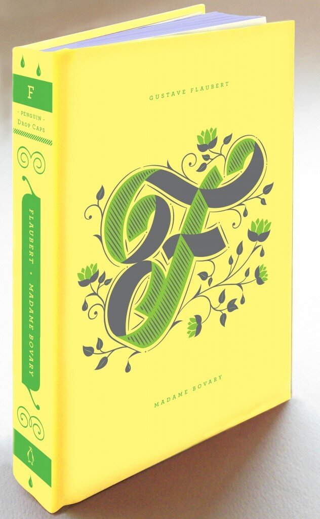
Meet Penguin Drop Caps, a new series of twenty-six collectible hardcover editions, featuring a specially commissioned illustrated letter of the alphabet by type designer Jessica Hische and a series design collaboration between Hische and Penguin Art Director Paul Buckley.
Writes Elda Rotor, Associate Publisher and Editorial Director of Penguin Classics:Penguin Drop Caps is a series inspired by typography—its beauty and its power of expression. A drop cap, or an initial cap, is the first letter of a word when designed and set larger than the surrounding text. It is used to introduce a new idea, paragraph, or chapter. We may recognize such elements from books of our childhood, from sacred and historic texts, and from beautiful early editions of classic literature. Whether they appear in illuminated fifteenth-century manuscripts set by scribes or digitally displayed on Jessica Hische’s own Daily Drop Cap blog, a drop cap letter impresses upon the reader the arrival of something of which to take note, something unique and special that deserves to be savored.
For the book lover, the series is a nod to the tradition of printing and the distribution of ideas, stories, and opinions—ranging from paper to digital media. For the writer and artist, the series pays homage to the significance of composition, texture, and form. With Penguin Drop Caps, we are inspired by the timeless tradition and craft of letters and their endless capacity to communicate.As you can see above, the series debuts this fall with:
A for Jane Austen’s Pride and Prejudice
B for Charlotte Brontë’s Jane Eyre
C for Willa Cather’s My Ántonia
D for Charles Dickens’ Great Expectations
E for George Eliot’s Middlemarch
F for Gustave Flaubert’s Madame Bovary (translation by Lydia Davis)
…with more to come!