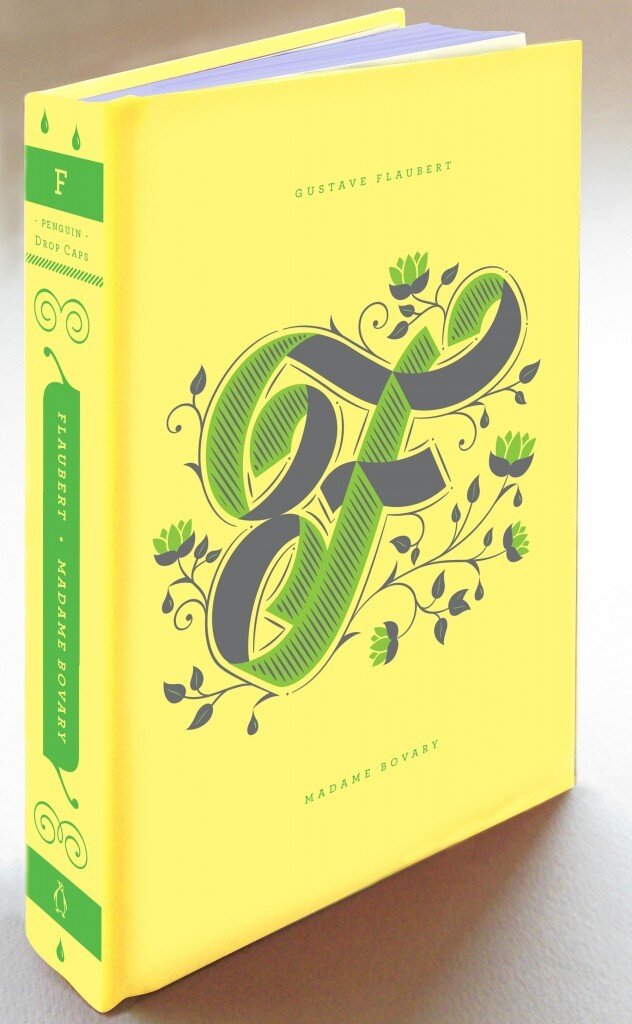
Meet Penguin Drop Caps, a new series of twenty-six collectible hardcover editions, featuring a specially commissioned illustrated letter of the alphabet by type designer Jessica Hische and a series design collaboration between Hische and Penguin Art Director Paul Buckley.
Writes Elda Rotor, Associate Publisher and Editorial Director of Penguin Classics:Penguin Drop Caps is a series inspired by typography—its beauty and its power of expression. A drop cap, or an initial cap, is the first letter of a word when designed and set larger than the surrounding text. It is used to introduce a new idea, paragraph, or chapter. We may recognize such elements from books of our childhood, from sacred and historic texts, and from beautiful early editions of classic literature. Whether they appear in illuminated fifteenth-century manuscripts set by scribes or digitally displayed on Jessica Hische’s own Daily Drop Cap blog, a drop cap letter impresses upon the reader the arrival of something of which to take note, something unique and special that deserves to be savored.
For the book lover, the series is a nod to the tradition of printing and the distribution of ideas, stories, and opinions—ranging from paper to digital media. For the writer and artist, the series pays homage to the significance of composition, texture, and form. With Penguin Drop Caps, we are inspired by the timeless tradition and craft of letters and their endless capacity to communicate.As you can see above, the series debuts this fall with:
A for Jane Austen’s Pride and Prejudice
B for Charlotte Brontë’s Jane Eyre
C for Willa Cather’s My Ántonia
D for Charles Dickens’ Great Expectations
E for George Eliot’s Middlemarch
F for Gustave Flaubert’s Madame Bovary (translation by Lydia Davis)
…with more to come!
Unit B1 , 419 Wick Lane
London, England, E3 2PX
07972807308
Your Custom Text Here


